Information graphics
From Wikipedia, the free encyclopedia

Information graphics or infographics are visual representations of information, data or knowledge. These graphics are used where complex information needs to be explained quickly and clearly[1], such as in signs, maps, journalism, technical writing, and education. They are also used extensively as tools by computer scientists, mathematicians, and statisticians to ease the process of developing and communicating conceptual information.
Contents |
[edit] Overview
Today information graphics surround us in the media, in published works both pedestrian and scientific, in road signs and manuals. They illustrate information that would be unwieldy in text form, and act as a visual shorthand for everyday concepts such as stop and go.
In newspapers, infographics are commonly used to show the weather, as well as maps and site plans for newsworthy events, and graphs for statistical data. Some books are almost entirely made up of information graphics, such as David Macaulay's The Way Things Work. Although they are used heavily in children's books, they are also common in scientific literature, where they illustrate physical systems, especially ones that cannot be photographed (such as cutaway diagrams, astronomical diagrams, and images of microscopic or sub-microscopic systems).
Modern maps, especially route maps for transit systems, use infographic techniques to integrate a variety of information, such as the conceptual layout of the transit network, transfer points, and local landmarks.
Traffic signs and other public signs rely heavily on information graphics, such as stylized human figures (the ubiquitous stick figure), icons and emblems to represent concepts such as yield, caution, and the direction of traffic. Public places such as transit terminals usually have some sort of integrated "signage system" with standardized icons and stylized maps.
Technical manuals make extensive use of diagrams and also common icons to highlight warnings, dangers, and standards certifications.
[edit] History
[edit] Early experiments
In prehistory, early humans created the first information graphics: cave paintings and later maps. Map-making began several millennia before writing, and the map at Çatalhöyük dates from around 7500 BCE. Later icons were used to keep records of cattle and stock. The Indians of Mesoamerica used imagery to depict the journeys of past generations. Illegible on their own, they served as a supportive element to memory and storytelling.
In 1626 Christopher Scheiner published the Rosa Ursina sive Sol which used a variety of graphics to reveal his astronomical research on the sun. He used a series of images to explain the rotation of the sun over time (by tracking sunspots).
In 1786, William Playfair published the first data graphs in his book The Commercial and Political Atlas. The book is filled with statistical graphs that represent the economy of 18th century England using bar charts and histograms. In 1801 Playfair introduced the first area chart in Statistical Breviary.[2]
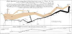
1861 saw the release of a seminal information graphic on the subject of Napoleon's disastrous march on Moscow. The creator, Charles Joseph Minard, captured four different changing variables that contributed to the failure, in a single two-dimensional image: the army's direction as they traveled, the location the troops passed through, the size of the army as troops died from hunger and wounds, and the freezing temperatures they experienced.
James Joseph Sylvester introduced the term "graph" in 1878 and published a set of diagrams showing the relationship between chemical bonds and mathematical properties. These were also the first mathematic graphs.
[edit] The development of a visual language in the 20th century
In 1936 Otto Neurath introduced a system of pictographs intended to function as an international visual or picture language. Isotype included a set of stylized human figures which were the basis for the ubiquitous modern stick figures.
In 1942 Isidore Isou published the Lettrist manifesto.
The 1972 Munich Olympics were the venue for Otl Aicher to introduce a new set of pictograms that proved to be extremely popular, and influenced the ubiquitous modern stick figures used in public signs.

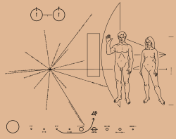
Also in 1972 the Pioneer Plaque was launched into space with the Pioneer 10 probe. Inscribed into the plaque was an information graphic intended as a kind of interstellar message in a bottle, designed by Carl Sagan and Frank Drake. The message is unique in that it is intended to be understood by extraterrestrial beings who would share no common language with humans. It depicts a picture of a man and a woman standing in front of a simplified silhouette of the probe in order to give a sense of scale. It also contains a map locating the sun relative to a number of pulsars, and a simplified depiction of the solar system, with the probe's path from earth into outer space shown with an arrow.
[edit] Information graphics subjects
[edit] Visual devices
Information graphics are visual devices indended to communicate complex information quickly and clearly. The devices include, according to Doug Newsom (2004)[1], charts, diagrams, graphs, tables, maps and lists. Among the most common devices are horizontal bar charts , vertical column charts, and round or oval pie charts, that can summarize a lot of statistical information. Diagrams can be used to show how a system works, and may be an organizational chart that shows lines of authority, or a systems flowchart that shows sequential movement. Illustrated graphics use images to related data. The snapshots features used every day by USA Today are good examples of this technique. Tables are commonly used and may contain lots of numbers. Modern interactive maps and bulleted numbers are also infographic devices.[1]
[edit] Elements of information graphics
The basic material of an information graphic is the data, information, or knowledge that the graphic presents. In the case of data, the creator may make use of automated tools such as graphing software to represent the data in the form of lines, boxes, arrows, and various symbols and pictograms. The information graphic might also feature a key which defines the visual elements in plain English. A scale and labels are also common.
[edit] Interpreting information graphics
Many information graphics are specialised forms of depiction that represent their content in sophisticated and often abstract ways. In order to interpret the meaning of these graphics appropriately, the viewer requires a suitable level of graphicacy. In many cases, the required graphicacy involves comprehension skills that are learned rather than innate. At a fundamental level, the skills of decoding individual graphic signs and symbols must be acquired before sense can be made of an information graphic as a whole. However, knowledge of the conventions for distributing and arranging these individual components is also necessary for the building of understanding.
[edit] Interpreting with a common visual language
In contrast to the above, many other forms of infographics take advantage of innate visual language that is largely universal. The disciplined use of the color red, for emphasis, on an otherwise muted design, demands attention in a primal way even children understand. Many maps, interfaces, dials and gauges on instruments and machinery use icons that are easy to grasp and speed understanding for safe operation. The use of a rabbit and a turtle icon to represent fast and slow, respectively, is one such successful use by the John Deere company on the throttle of their tractors.
[edit] Modern practitioners
A statistician and sculptor, Edward Tufte has written a series of highly regarded books on the subject of information graphics. Tufte also delivers lectures and workshops on a regular basis. He describes the process of incorporating many dimensions of information into a two-dimensional image as 'escaping flatland' (alluding to the 2-dimensional world of the Victorian novella Flatland).
The work done by Peter Sullivan for The Sunday Times in the 1970s, 80s and 90s, was one of the key factors in encouraging newspapers to use more graphics. Sullivan is also one of the few authors who have written about information graphics in newspapers. Likewise the staff artists at USA Today, the colorful United States newspaper that debuted in 1982, firmly established the philosophy of using graphics to make information easier to comprehend. The paper received criticism for oversimplifying news and sometimes creating infographics that emphasized entertainment over respect for content and data, sometimes referred to as chartjunk. While worthy of much of this derision, its role in establishing infographics as a practice cannot be ignored.
Nigel Holmes is an established commercial creator of what he calls "explanation graphics". His works deal not only with the visual display of information but also of knowledge - how to do things. He created graphics for Time magazine for 16 years, and is the author of several books on the subject.
Close and strongly related to the field of information graphics, is information design. Actually, making infographics is a certain discipline within the information design world. Author and founder of the TED (conference), Richard Saul Wurman, is considered the originator of the phrase, "information architect", and many of his books, such as Information Anxiety, helped propel the phrase, "information design", from a concept to an actual job category.
While the art form of infographics has its roots in print, by the year 2000, the use of Adobe Flash-based animations on the web has allowed to make mapping solutions and other products famous and addictive by using many key best practices of infographics.
Likewise, their use in television is relatively recent, for in 2002, two Norwegian musicians of Röyksopp issued a music video for their song Remind Me that was completely made from animated infographics. In 2004, a television commercial for the French energy company Areva used similar animated infographics and both of these videos and their high visibility have helped the corporate world recognize the value in using this form of visual language to describe complex information efficiently.
[edit] See also
- A picture is worth a thousand words
- Charts
- Digital dashboard
- Graphic design
- Graphic image development
- Graphic organizers
- Information design
- List of information graphics software
- Scientific visualization
- Statistical graphics
- Technical illustration
- Visualization (graphic)
[edit] References
[edit] Further reading
- William S. Cleveland (1985). The Elements of Graphing Data. Summit, NJ: Hobart Press.
- William S. Cleveland (1993). Visualizing Data. Summit, NJ: Hobart Press.
- Paul Lewi (2006). "Speaking of Graphics".
- Thomas L. Hankins (1999). "Blood, dirt, and nomograms: A particular history of graphs". In: Isis, 90:50–80.
- Robert L. Harris (1999). Information Graphics: A Comprehensive Illustrated Reference. Oxford University Press.
- Eric K. Meyer (1997). Designing Infographics. Hayden Books.
- Edward R. Tufte (1983). The Visual Display of Quantitative Information. Edition, Cheshire, CT: Graphics Press.
- Edward R. Tufte (1990). Envisioning Information. Cheshire, CT: Graphics Press.
- Edward R. Tufte (1997). Visual Explanations: Images and Quantities, Evidence and Narrative. Cheshire,
- Edward R. Tufte (2006). Beautiful Evidence. Cheshire. CT: Graphics Press.
- John Wilder Tukey (1977). Exploratory Data Analysis. Addison-Wesley.
[edit] External links
| Wikimedia Commons has media related to: Information graphics |
- Periodic Table of Visualization Methods
- Milestones in the History of Thematic Cartography, Statistical Graphics and Data Visualization
- NSF Science & Engineering Visualization Challenge
- Society for Newsdesign
- Open Mind Map Library - Free library of mind maps.
- Integration and Application Network Conceptual Diagram Symbol Libraries - Free vector symbol libraries for communicating environmental science through conceptual diagrams.
- Semi-Structured and Unstructured Information Systems: Information Visualization Summary Review Book Chapter.
|
||||||||||||||


