History of Western typography
From Wikipedia, the free encyclopedia

Contemporary typographers view typography as craft with a very long history tracing its origins back to the first punches and dies used to make seals and currency in ancient times. The basic elements of typography are at least as old as civilization and the earliest writing systems—a series of key developments that were eventually drawn together as a systematic craft. Some historians view the parallel development of technique in China as separate from that in mid-15th century Europe, while others view them as connected.
[edit] Etymology
Typography (from the Greek words τύπος type = "to strike" "That by which something is symbolized or figured …" and γραφία graphia = to write).
[edit] Medieval design roots

Typography, type-founding and typeface design began as closely related crafts in mid-15th century Europe with the introduction of movable type printing at the junction of the medieval era and the Renaissance. Handwritten letterforms of the mid-15th century embodied 3000 years of evolved letter design, and were the natural models for letterforms in systematized typography. The scribal letter known as textur or textualis, produced by the strong gothic spirit of blackletter from the hands of German area scribes, served as the model for the first text types.
Johannes Gutenberg employed the scribe Peter Schöffer to help design and cut the letterpunches for the first typeface—the D-K type of 202 characters used to print the first books in Europe. A second typeface of about 300 characters designed for the 42-line Bible ca. 1455 was probably cut by the goldsmith Hans Dunne with the help of two others—Götz von Shlettstadt and Hans von Speyer.
Cultural tradition ensured that German typography and type design remained true to the gothic/blackletter spirit; but the parallel influence of the humanist and neo-classical typography in Italy catalyzed textur into four additional sub-styles that were distinct, structurally rich and highly disciplined: Bastarda, fraktur, rotunda, and Schwabacher.
The rapid spread of movable type printing across Europe produced additional Gothic, half-Gothic and Gothic-to-roman transitional types. Johann Bámler's Schwabacher, Augsburg appeared in 1474. The half-Gothic Rotunda type of Erhard Ratdolt ca. 1486 was cut to suit Venetian taste. In 1476 William Caxton printed the first books in England with a so-called Bâtarde type (an early Schwabacher design), but soon abandoned it.
[edit] Classical revival
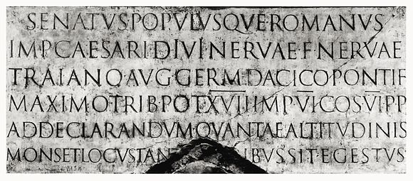
In Italy the heavy gothic styles were soon displaced by Venetian or "old style" Latin types, also called antiqua. The inscriptional capitals on Roman buildings and monuments were structured on a euclidean geometric scheme and the discrete component-based model of classical architecture. Their structurally-perfect design, near-perfect execution in stone, balanced angled stressing, contrasting thick and thin strokes, and incised serifs became the typographic ideal for western civilization. The best-known example of Roman inscriptional capitals exists on the base of Trajan's Column, inscribed ca. 113.
In their enthusiastic revival of classical culture, Italian scribes and humanist scholars of the early 15th century searched for ancient minuscules to match the Roman inscriptional capitals. Practically all of the available manuscripts of classical writers had been rewritten during the Carolingian Renaissance, and with a lapse of three hundred years since the widespread use of this style, the humanist scribes mistook Carolingian minuscule as the authentic writing style of the ancients. Dubbing it lettera antica, they began by copying the minuscule hand almost exactly, combining it with Roman capitals in the same manner as the manuscripts they were copying.[1]

Upon noticing the stylistic mismatch between these two very different letters, the scribes redesigned the small Carolingian letter, lengthening ascenders and descenders, and adding incised serifs and finishing strokes to integrate them with the Roman capitals. By the time moveable type reached Italy several decades later, the humanistic writing had evolved into a consistent model known as humanistic minuscule, which served as the basis for type style we know today as Venetian.[1]
[edit] Transition from humanistic minuscule to roman type
The classically-endowed city of Rome attracted the first printers known to have set up shop outside Germany, Arnold Pannartz and Konrad Sweynheim, closely followed by the brothers Johann and Wendelin of Speyer (de Spira), and the Frenchman Nicolas Jenson. The sequence of appearance and production dates for types used by these printers have yet to be established with certainty; all four are known to have printed with types ranging from textur Gothic to fully-developed romans inspired by the earlier humanistic writing, and within a few years the center of printing in Italy shifted from Rome to Venice.
Some time before 1472 in Venice, Johann and Wendelin issued material printed with a half-Gothic-half-roman type known as "Gotico-antiqua". This design paired simplified Gothic capitals with a rationalized humanistic minuscule letter set, itself combining Gothic minuscule forms with elements of Carolingian, in a one step forward, half step back blending of styles.
Around the same time (1468) in Rome, Pannartz and Sweynheim were using another typeface that closely mimicked humanistic minuscule, known as "Lactantius". Unlike the rigid fractured forms of Speyer's half-Gothic, the Lactantius is characterized by smoothly rendered letters with a restrained organic finish. The Lactantius a departed from both the Carolingian and Gothic models; a vertical backstem and right-angled top replaced the diagonal Carolingian structure, and a continuous curved stroke replaced the fractured Gothic bowl element.
For details on the evolution of lower case letterforms from Latin capitals, see Latin alphabet.
Individual letters: Aa Bb Cc Dd Ee Ff Gg Hh Ii Jj Kk Ll Mm Nn Oo Pp Qq Rr Ss Tt Uu Vv Ww Xx Yy Zz
[edit] Development of roman type
Nicolas Jenson began printing in Venice with his original roman font from 1470. Jenson's design and the very similar roman types cut by Francesco Griffo ca. 1499 and Erhard Radolt ca. 1486 are acknowledged as the definitive and archetypal roman faces that set the pattern for the majority of western text faces that followed.
The Jenson roman was an explicitly typographic letter designed on its own terms that declined to imitate the appearance of hand-lettering. Its effect is one of a unified cohesive whole, a seamless fusion of style with structure, and the successful convergence of the long progression of preceding letter styles. Jenson adapted the structural unity and component-based modular integration of Roman capitals to humanistic minuscule forms by masterful abstract stylization. The carefully-modelled serifs follow an artful logic of asymmetry. The ratio of extender lengths to letter bodies and the distance between lines results in balanced, harmonious body of type. Jenson also mirrors the ideal expressed in renaissance painting of carving up space (typographic "white space") with figures (letters) to articulate the relationship between the two and make the white space dynamic.

The name "roman" is customarily applied uncapitalized to distinguish early Jenson and Aldine-derived types from classical Roman letters of antiquity. Some parts of Europe call roman "antiqua" from its connection with the humanistic "lettera antica"; "medieval" and "old-style" are also employed to indicate roman types dating from the late 15th century, especially those used by Aldus Manutius (Italian: Manuzio). Roman faces based on those of Speyer and Jenson are also called Venetian.
[edit] Italic type
The humanist spirit driving the Renaissance produced its own unique style of formal writing, known as "cursiva humanistica". This slanted and rapidly written letter, evolved from humanistic minuscule and the remaining Gothic current cursive hands in Italy, served as the model for cursive or italic typefaces. As books printed with early roman types forced humanistic minuscule out of use, cursiva humanistica gained favor as a manuscript hand for the purpose of writing. The popularity of cursive writing itself may have created some demand for a type of this style. The more decisive catalyst was probably the printing of pocket editions of Latin classics by Aldus Manutius.
The "Aldino" italic type, commissioned by Manutius and cut by Franceso Griffo in 1499, was a closely-spaced condensed type. Griffo's punches are a delicate translation of the Italian cursive hand, featuring letters of irregular slant angle and uneven height and vertical position, with some connected pairs (ligatures), and unslanted small roman capitals the height of the lower case t. The fame of Aldus Manutius and his editions made the Griffo italic widely copied and influential, although it was not the finest of the pioneer italics. The "Aldino" style quickly became known as "italic" from its Italian origin.
Around 1527 the Vatican chancellery scribe Ludovico Arrighi designed a superior italic type and had the punches cut by Lauticio di Bartolomeo dei Rotelli. The more modular structure of Arrighi's italic and its few ligatures made it less a copy of the cursive hand than Griffo's. Its slightly taller roman capitals, a gentler slant angle, taller ascenders and wider separation of lines gave the elegant effect of refined handwriting.

Surviving examples of 16th century Italian books indicate the bulk of them were printed with italic types. By mid-century the popularity of italic types for sustained text setting began to decline until they were used only for in-line citations, block quotes, preliminary text, emphasis, and abbreviations. Italic types from the 20th century up to the present are much indebted to Arrighi and his influence on French designers.
Swiss art historian Jakob Burckhardt described the classically-inspired Renaissance modello of dual case roman and cursive italic types as "The model and ideal for the whole western world". Venetian pre-eminence in type design was brought to an end by the political and economic turmoil that concluded the Renaissance in Italy with the sack of Rome in 1527.
[edit] Renaissance Germany and Switzerland
Soon after 1500, roman typefaces began to gain popularity north of the Alps for printing of Latin literature. Johann Froben of Basel, Switzerland set up his press in 1491, and by about 1519 (when he printed Erasmus's famous edition of the Greek New Testament) he had established a set of standards for humanistic printing which were widely copied throughout the German-speaking world and also in Spain and, to a lesser extent in England. His principal type is wholly roman in the shape of the characters but retains an echo of gothic influence in the angled serifs and the way the thick and thin strokes are organized; it was coupled with mated sets of woodcut initials (often designed by distinguished artists) and with two larger sizes of uppercase letters for use in title pages and headings—Froben was the first to use such 'display faces' consistently, breaking away from the Italian tradition in which title pages and headings tended to be set in the same size as the main text. By using these large faces, Froben developed the title page as a fully organized artistic whole. Froben's italic face is based on that of Aldus but more even and uniform in effect. These Swiss books are the first to have been designed in every detail as printed artifacts rather than as adaptations of manuscript technique.
After about 1550 this Swiss/German tradition was gradually overwhelmed by French influence. Towards the end of the century, the Wechel family of Frankfurt was producing fine books which used French typefaces in conjunction with heavy but resplendent woodcut ornaments to achieve a splendid page effect; but soon after 1600 there was a general, marked decline in the quality of both skill and materials, from which German printing did not recover until the twentieth century.
[edit] 16th century France
Typography was introduced to France by the German printers Martin Crantz, Michael Freyburger and Ulrich Gering, who set up a press in Paris in 1470, where they printed with an inferior copy of the Lactantius type. Gothic types dominated in France until the end of the 15th century, when they were gradually supplanted by roman designs. Jodocus Badius Ascensius (Josse Bade) in partnership with Henri Estienne established a press in Paris in 1503. Printing with undeveloped Roman and half-Gothic types, the French pair were too occupied meeting the demand for Humanistic and classical texts to design any original types of their own. French books nonetheless began to follow the format established by Italian printers, and Lyon and Paris became the new centers of activity.
[edit] De Colines, Estienne, and Augereau
After their 1494 invasion of Italy the French were greatly influenced by Renaissance culture, and later set about converting French culture from Gothic to neo-classical. The required phonetic and orthographic changes to French language hindered the evolution of type design in France until the late 1520s. At the end of this period roman types introduced by Robert Estienne, Simon de Colines and Antoine Augereau began a phase of type design with a distinctly French character. Robert Estienne carried on the establishment of his father Henri Estienne, who had died in 1520. Simon de Colines had been the elder Estienne's assistant, married his widow, and set up his own press.
The de Colines roman of 1531 resembled Griffo's 1499 roman but did not copy it closely. Narrower forms and tighter letter fit; a with low angled bowl; elevated triangular stem serifs on i, j, m, n and r; flattened baseline serifs, delicately-modeled ascender serifs and graceful, fluid lines characterize the French style. Robert Estienne's roman of 1532 was similar to the de Colines face, which Estienne complemented with a fine italic type based on that of Arrighi. The craftsmen who cut the punches for the romans used by Estienne and de Colines remain unidentified. In 1532 Antoine Augereau cut the punches for a roman type very close to Estienne's. The lower cases of the Estienne and Augereau types became the basis for post-Renaissance old style typography, and were copied by French typographers for the next 150 years.
[edit] Garamond
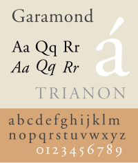
The svelte French style reached its fullest refinement in the roman types attributed to the best-known figure of French typography—Claude Garamond (also Garamont). In 1541 Robert Estienne, printer to the king, helped Garamond obtain commissions to cut the sequence of Greek fonts for François I, known as the "grecs du roi". A number of roman faces used in Garamond's publishing activities can be positively attributed to him as punch-cutter. From the dates of their appearance, and their similarity to romans used by Estienne, Christoffel Plantijn and the printer André Wechel, the types known as "Canon de Garamond" and "Petit Canon de Garamond" shown on a specimen sheet issued by the Egenolff-Berner foundry in 1592 are generally accepted as Claude Garamond's final roman types.
[edit] Robert Granjon
Robert Granjon worked in the second half of the 16th century, mainly at Lyon, but was also recorded at Paris, Rome and Antwerp. His main contribution was an italic type known as "Parangon de Granjon". Italic type design had apparently become corrupted since the Arrighi and Aldine models. Granjon's italic had a greater slant angle, slanted roman capitals, and reduced weight and rigor. These qualities and its contrasting thick and thin strokes gave it a dazzling appearance that made it difficult to read. It was nevertheless the main influence for italic type design until the Arrighi model was revived in 1920.
[edit] Transition to modern type: 17th and 18th century
Baroque and rococo aesthetic trends, use of the pointed-pen for writing, and steel engraving techniques effected a gradual shift in typographic style. Contrast between thick and thin strokes increased. Tilted stressing transformed into vertical stressing; full rounds were compressed. Blunt bracketed serifs grew sharp and delicate until they were fine straight lines. Detail became clean and precise.
Transitional roman types combined the classical features of lettera antiqua with the vertical stressing and higher contrast between thick and thin strokes characteristic of the true modern romans to come.
The roman types used ca. 1618 by the Dutch printing firm of Elzevir in Leyden reiterated the 16th century French style with higher contrast, less rigor and a lighter page effect. After 1647 most Elziver faces were cut by the highly-regarded Christoffel van Dyck, whose precise renditions were regarded by some experts at the time as finer than Garamond's.
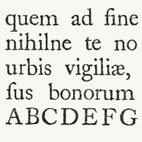
[edit] Fell types

From mid-16th century until the end of the 17th, interference with printing by the British Crown thwarted the development of type founding in England—most type used by 17th century English printers was of Dutch origin. The lack of material inspired Bishop of Oxford Doctor John Fell to purchase punches & matrices from Holland ca. 1670–1672 for use by the Oxford University Press. The so-named Fell types, presumed to be the work of Dutch punchcutter Dirck Voskens, mark a noticeable jump from previous designs, with considerably shorter extenders, higher stroke contrast, narrowing of round letters, and flattened serifs on the baseline and descenders. The design retained a retrogressive old-style irregularity, smooth modeling from vertical to horizontal, and angled stressing of rounds (except a vertically-stressed o). Fell capitals were condensed, even-width, with wide flattened serifs; all characteristics of the definitive modern romans of the late 18th century. Fell italic types were distinguished by high contrast matching the Fell romans; wider ovals; a split-branching stroke from the stems of m n r and u; and long, flat serifs—prefiguring modern. They repeated the non-uniform slant of French models, and the capitals included swash J and Q forms.
[edit] Caslon
The first major figure in English typography is reckoned by type historians to have ended the monopoly of Dutch type founding almost single-handedly. The gun engraver-turned-punchcutter William Caslon spent 14 years creating the stable of typefaces on the specimen sheet issued in 1734. The complete canon included roman, italic, Greek, Hebrew, Arabic etc. Caslon's Great Primer roman and English roman were retrogressive designs that very closely followed the Fell types and the roman of Miklós (Nicholas) Kis ca. 1685 falsely attributed to Anton Janson. Like the Fells, Caslon's slightly bracketed serifs and old-style irregularity gave it a homely charm—its precise cut and perpendicularity place it firmly in the eighteenth century however. Caslon's italic structures follow the Fell italics, but at a condensed width and with conventional branching from stems.
William Caslon's prodigious output was influential worldwide. Caslon type and its imitations were used throughout the expanding British empire. It was the dominant type in the American colonies for the second half of the 18th century. Caslon marks the rise of England as the center of typographic activity.
[edit] Fleischmann
Johann Michael Fleischmann (1701–1768) was born in Nürnberg where he trained as a punchcutter. He found employment with Dutch type founders in Holland and settled there ca. 1728. At the Enschedé foundry in Haarlem he cut punches for a large amount of material. Some time after 1743 he produced a distinguished roman design—related to the preceding transitional types but departing from them. It prefigured modern romans with sparse transaxial modeling joining the vertical stressing to hairline thins, and ball-ends. Fleischman borrowed from the general mode of Phillipe Grandjean 's "romain du roi" "king's roman" commissioned by Louis XIV in 1692 for the Imprimerie Royale, but did not imitate that face. Fleischman's capitals were a new variety; an even-width scheme, compressed rounds, all-vertical stressing, and triangular beak ends of E F L T and Z, all characteristics prefiguring the "classical" moderns of Bodoni and Didot. Fleischman's italic bore some resemblance to Granjean's but had longer ascenders and followed the established Dutch structures for h v and w.
Fleischman was held in great esteem by his contemporaries, his designs exerting a decisive influence in the last quarter of the 18th century. Renowned French punchcutter Pierre Simon Fournier (1712-1768), confessed to having copied Fleischman's design, and was first to dub "contrast" types like the Fells, Caslon and Fleischman "modern". Fournier's rococo-influenced designs—Fournier and Narcissus—and his Modèles des Caractères (1742) continued the romaine du roi style and adapted it for his own modern age. Like Baskerville, his italics were inspired by handwriting and the engraved lettering known as copperplate hand. Fournier also published a two volume Manuel Typographique, in which he recorded much European typographic history, and introduced the first standardized system of type size measurement—the "point".
[edit] Baskerville

The roman and italic types of John Baskerville ca. 1772 appeared later than Fleischman's but are considered transitional and partly retrogressive with a return to lower contrast, smooth transaxial modeling, finely-modeled bracketed serifs, and long stems. The exquisite design and finish of Baskerville's roman however, combining elegance and strength, was modern. His roman design, and especially his italic, were rococo-influenced. His designs did not visibly quote any previous types. They were informed by his prior experience as a writing master and the influences of his time. The types of Joseph Fry, Alexander Wilson, and John Bell closely followed Baskerville, and through his correspondence with European type founders Baskerville's influence penetrated most of western Europe. Baskerville was a meticulous artist who controlled all aspects of his creation, devising more accurate presses, blacker inks and paper sealed with hot rollers to ensure crisp impressions. Of particular note, the lower storey of his lowercase g does not fully close. Derivatives of Baskerville are often identified thus. A modern revival of Baskerville, a font called Mrs Eaves, is named after Baskerville's wife who was the widow of Richard Eaves.[2]
[edit] Modern romans


True modern romans arrived with the types of the Italian Giambattista Bodoni and the French Didots. Completing trends begun by the Fell types, Fleischman, Fournier and Baskerville, the so-called "classical" modern romans eschewed chirographic and organic influences, their synthetic symmetric geometry answering to a rationalized and reformed classical model driven by the strict cartesian grid philosophy of René Descartes and the predictable clockwork universe of Isaac Newton.
The "classical" appellation of modern romans stems from their return to long ascenders and descenders set on widely-spaced lines, and a corresponding light page effect reminiscent of old-style—occurring at a time of classical revival.
Bodoni was foremost in progressing from rococo to the new classical style. He produced an italic very close to Baskerville's, and a French cursive script type falling in between italic type and joined scripts. The roman types of Francois Ambroise Didot and son Firmin Didot closely resemble the work of Bodoni, and opinion is divided over whether the Didots or Bodoni originated the first modern romans. At any rate the Didots' mathematical precision and vanishing of rococo design reflected the "enlightenment" of post-revolution France under Napoleon. Francois Ambroise also designed "maigre" and "gras" types corresponding to later condensed and expanded font formats.
The Spanish designer Joaquín Ibarra's roman was influenced by Baskerville, Didot and Bodoni, but hewn nearer to old-style and used in the same classical manner, including spaced capitals. In England modern romans resembling Bodoni's were cut for the printer William Bulmer ca. 1786 by the punchcutter William Martin, who had been apprenticed to Baskerville and influenced by him. Martin's italic mirrored the open-tail g and overall finesse of Baskerville's.
[edit] 19th and 20th century typography
[edit] Industrialisation
The 19th century brought fewer stylistic innovations. The most notable invention was the rise of typefaces with strengthened serifs. Forerunners were the so-called Egyptienne fonts, which were used already at the beginning of the 19th century. Their name likely comes from the enthusiasm of the Napoleonic era for the orient, which in turn was started by Napoleon's invasion in Egypt. In fact slab-serif fonts (e. g. Clarendon from 1845) were newspaper fonts, whose serifs were strengthened in order to prevent damage during the printing process. Stylistically the serif fonts of the mid-19th century appeared very robust and otherwise had more or less neo-classical design features, which changed during the course of time: By the application of the slab serif design feature and by appending serifs to more and more typefaces, an independent intermediate group of heterogeneous fonts emerged during the 20th century. Meanwhile the slab serifs are listed as an independent group in most typeface classifications–besides both main groups serif and sans serif.
Above all the 19th century was innovative regarding technical aspects. Automatic manufacturing processes changed the print as well as the graphical illustrations. The illustration of printed matters could be considerably standardised due to the lithography technique invented by Alois Senefelder. Finally, another invention was photography, whose establishment at the end of the century led to the first halftoning and reproduction procedures. The step-by-step development of a modern mass society provided a growing demand of printed matters. Besides the traditional letterpress beginnings of a newspaper landscape as well as a broad market for publications, advertisements, and posters of all kinds appeared. The challenges had changed: since printing and typography had been a straightforward craft for centuries, it now had to face the challenges of a industry-ruled mass society.
[edit] Hot type and phototypesetting in the 20th century


The 90 years between 1890 and 1980 coined typography until now. The craft of printing became an industry, and the typography became a part of it as well. Both stylistically and technologically this epoch was really tumultuous. The significant developments were the following:
- The fabrication and application of typefaces more and more were affected by industrial manufacturing processes. Significant incidents were the invention of the hot type machine by Ottmar Mergenthaler (Linotype machine, 1886) and Tolbert Lanston (Monotype machine, 1887) and a few decades later the emergence of phototypesetting. The result: Compilation and typographical design of the text could be more and more controlled by keyboards in contrast to manual typesetting.
- A result of the industrialisation process was the unimagined number and distribution of new typefaces. Whether digital variants of Garamond and Bodoni or new contemporary type designs like Futura, Times, and Helvetica: nearly all currently used typefaces have their origin either in the following and ongoing digital typesetting era or are based on designs of this epoch. The basis was the appearance of large type foundries and type manufacturers. The result: Successful typefaces could quickly gain the status of a trademark–and therefore were able to assign a unique "branding" to products or publications.
- Besides the traditional typography of books graphic design became a more or less independent branch. The tensions between those two branches significantly determined the stylistic development of 20th century's typography.
[edit] Art nouveau and New Book Art

Since impressionism the modern art styles were reflected in graphic design and typography too. Since 1890 the Art nouveau became popular. Its floral ornaments, the curved forms, as well as the emphasis on graphical realisation inspired the type designers of the turn of the century. A popular art nouveau font was the Eckmann designed by graphic artist Otto Eckmann. Furthermore, the influence of art nouveau was expressed in a lot of book illustrations and exlibris designs.
Altogether the return to the roots of book art become stronger at the turn of the century. It was initiated by British typographer, socialist, and private press publisher William Morris as well as by the Arts and Crafts Movement, which refers to him. Essentially this movement initiated three things: a return to the antiqua-models of the Renaissance, clarity and simplicity of book illustrations, and straightforward technical processes during the production of printed matters. An immediate consequence of the Arts and Crafts Movement was the establishment of the private press movement, which more or less was committed to Morris' ideals, and whose remains partially are still present today. An established meeting point of these scene in Germany for example is the Mainzer Minipressen-Messe, which actually is hold every two years.
Especially the New Book Art movement, which formed in the decade before World War I, was influenced by the Arts and Crafts Movement. The young type designers of the pre-war era, among them Fritz Helmuth Ehmcke and Friedrich Wilhelm Kleukens, rejected both the late typographical classicism and the ornaments of the popular Art nouveau. The new ideal became a tidy and straightforward book typography, which dedicated itself to the ideas of the Renaissance. Walter Tiemann in Leipzig, Friedrich Hermann Ernst Schneidler in Stuttgart, and Rudolf Koch in Offenbach as instructors were the mentors of this kind of typography. They stayed influential in the field of book typesetting until a long time after the end of World War II.
[edit] See also
[edit] References
- ^ a b Nesbitt, Alexander The History and Technique of Lettering (c) 1957, Dover Publications, Inc. ISBN 0486204278 OCLC 654540. The Dover edition is an abridged and corrected republication of the work originally published in 1950 by Prentice-Hall, Inc. under the title Lettering: The History and Technique of Lettering as Design.
- ^ Penney, Chris. "Dr B T Davis's bequest". Research Libraries Bulletin (University of Birmingham Information Services) (6): p 21. ISSN 1355-9877. http://www.special-coll.bham.ac.uk/rlb_autumn98.pdf. Retrieved on 2008-10-16.
- Burke, James The Day the Universe Changed (c) 1985, ISBN 0-316-11695-5. Eight moments in history when a change in knowledge radically altered man's understanding of himself and the world. Chapter 4. Matter of Fact, details on the development of moveable type in Korea and Europe.
- Heller, Steven and Meggs, Phillip B Texts on Type: Critical Writings on Typography (c) 2001, Allworth Press, Allworth Communications, New York. ISBN 1-58115-082-2. A compilation of over fifty texts on the history, practice, and aesthetics of type design and typography. Section 4 Movement: Defining Modernism essays by Herbert Bayer, Jan Tschichold, Jeffery Keedy.
- Man, John The Gutenberg Revolution:The story of a genius that changed the world (c) 2002 Headline Book Publishing, a division of Hodder Headline, London. ISBN 0-7472-4504-5. A detailed examination of Gutenberg's life and invention, skillfully interwoven with the underlying social and religious upheaval of Medieval Europe on the eve of the Renaissance.
- McKitterick, David. Print, Manuscript, and the Search for Order, 1450-1830" N.Y. & Cambridge:{Cambridge University Press,2003 ISBN 052182690X. Deals with the social, religious, and technical influences on typography and book design.
- Swanson, Gunnar Graphic Design and Reading: explorations of an uneasy relationship (c) 2000, Allworth Press, Allworth Communications, New York. ISBN 1-58115-063-6. The Myth of Content and the Encyclopedestrianization of Communication by James Souttar; Tracing the Invisible by Katie Salen.
This article incorporates text translated from the corresponding German Wikipedia article as of 2008-07-24.
[edit] External links
- Colorado College picture catalogue of Incunabula
- Comp.fonts FAQ: General Info Section four of six of the newsgroup FAQ
- Twenty Faces
- Planet typography A magazine on contemporary typography + a directory, a manual and other topics related to typography
- The Printed Book
- ABC typography. A virtual type museum

