Em (typography)
From Wikipedia, the free encyclopedia
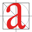
An em is a unit of measurement in the field of typography, equal to the point size of the current font. This unit is not defined in terms of any specific typeface, and thus is the same for all fonts at a given point size.[1] So, 1 em in a 16 point typeface is 16 points.
Contents |
[edit] History
In metal type, the point size (and hence the em) is measured as the height of the metal body from which the letter rises. In metal type (possible overhangs aside), the physical size of a letter could not normally exceed the em.
In digital type, the em is a grid of arbitrary resolution that is used as the design space of a digital font. Imaging systems, whether for screen or for print, work by scaling the em to a specified point size.
In digital type, the relationship of the height of particular letters to the em is arbitrarily set by the typeface designer. However, as a very rough guideline, an "average" font might have a cap height of 70% of the em, and an x-height of 48% of the em.
[edit] Incorrect and alternate definitions
One em is sometimes said to be equal to the width of a capital "M" in a particular typeface, as the "M" was commonly cast the full-width of the square "blocks", or "em-quads" (also "mutton-quads"), which are used in printing presses. However, in modern typefaces, the character M is usually somewhat less than one em wide. Moreover, as the term has expanded to include a wider variety of languages and character sets, its meaning has evolved; this has allowed it to include those fonts, typefaces, and character sets which do not include a capital "M", such as Chinese and the Arabic alphabet. Thus, em generally means the height of a font in question.
This is the traditional definition shown in the Adobe Glossary and the Pocket Oxford Dictionary Third revised edition 1996.
[edit] Related terms
An "em-quad" is a metal spacer used in printing presses. It is referred to by this name because it is composed of a square one em on each side. In these old-fashioned printing presses, this allowed the insertion of an em space ( ) character between other typographical characters. It is also occasionally referred to as a "mutton quad".
The width of the em space ( ) is defined to be 1 em, as is the em dash (—). By contrast, the narrower unit en is half an em.
Online, the use of the em measurement has become more common; with the development of Cascading Style Sheets (or CSS), the W3C best practices recommendations within HTML and online markup now call for web pages to be based on scalable designs, using a relative unit of measurement (such as the em measurement), rather than a fixed one such as pixels ("px") or points.
[edit] References
[edit] Notes
- ^ Bringhurst, Robert (1992). The Elements of Typographic Style. Vancouver, BC: Hartley & Marks. pp. 25–26. ISBN 9780881790337. OCLC 25411784.
[edit] External links
- The amazing em unit and other best practices — Web Content Accessibility Guidelines Working Group.
- Typophile Discussion: The Em
- Em Calculator (for CSS Layouts)
- An EM calculator/converter
|
|||||||||||||||||||||||||||||||


