Font
From Wikipedia, the free encyclopedia
In typography, a font (also fount) is traditionally defined as a complete character set of a single size and style of a particular typeface. For example, the set of all characters for 9-point Bulmer italic is a font, and the 10-point size would be a separate font, as would the 9 point upright.
Since the introduction of computer fonts based on fully scalable outlines, a broader definition has evolved. Font is no longer size-specific, but still refers to a single style. Bulmer regular, Bulmer italic, Bulmer bold and Bulmer bold italic are four fonts, but one typeface.
However, the term font is also often used as a metonym for typeface.
Contents |
[edit] Pre-digital printing
In a traditional manual printing (letterpress) house the font would refer to a complete set of metal type that would be used to type-set an entire page. Unlike a digital typeface it would not include a single definition of each character, but commonly used characters (such as vowels and periods) would have more physical type-pieces included. A font when bought new would often be sold as (for example in a roman alphabet) 12pt 14A 34a, meaning that it would be a size 12pt fount containing 14 upper-case 'A's, and 34 lower-case 'A's. The rest of the characters would be provided in quantities appropriate for the language it was required for in order to set a complete page in that language. Some metal type required in type-setting, such as varying sizes of inter-word spacing pieces and line-width spacers, were not part of a specific font in pre-digital usage, but were separate, generic pieces.[1]
[edit] Font characteristics
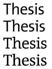
Besides the character height when using the mechanical sense of the term, there are several characteristics which may distinguish fonts, also depending on the script(s) that the typeface supports. In European alphabetic scripts, i.e. Roman, Cyrillic and Greek, the main such properties are the stroke width, called weight, the style or angle and the character width.
Most typefaces are focused on the roman script and hence the regular or standard font is often labeled roman, both to distinguish it from bold or thin and from italic or oblique. The keyword for the default, regular case is often omitted for variants and never repeated, otherwise it would be Bulmer regular italic, Bulmer bold regular and even Bulmer regular regular.
Different fonts of the same face may be used in the same work for various degrees and types of emphasis.
[edit] Weight
The weight of a particular font is the thickness of the character outlines relative to their height.
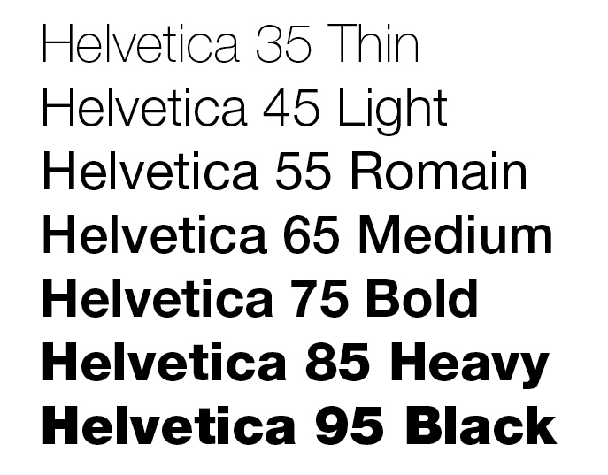
There are three basic categories of weights: light, normal, bold. There can be fewer weights in a typeface on the one hand and there can be finer differences, but there are never more than a total of nine font weights per typeface, three per group. Many computer fonts for office, Web and non-professional use come with a normal and a bold weight. If even this is not provided many renderers (browsers, word processors, graphic and DTP programs) support faking a bolder font by algorithmically increasing the stroke width.
The base weight differs among typefaces, that means one normal font may appear bolder than some other normal font. For example fonts intended to be used in posters are often quite bold by default while fonts for long runs of text are rather light. Therefore weight keywords in their names may differ in regard to absolute position, e.g. bold usually is at the seventh of nine (virtual) positions, but sometimes at the sixth. The standard, regular font weight for most typefaces is slightly lighter than medium, i.e. it commonly is the fourth.
The ideal of nine font weights has lead to a numerical classification first used by Adrian Frutiger with the Univers typeface, although therein only ranging from 3 to 8. Later typographers introduced a larger scale from 100 through 900, available for instance in CSS, where virtual values 0 and 1000 can be assumed to represent no-ink and all-ink.
There are several keywords used to describe the weight of a font in its name, differing among type foundries and designers, but their relative order is usually fixed like this:
- thin
- ultra-light
- extra-light
- light
- semi-light = semi
- book
- normal
- regular
- roman
- plain
- medium
- demi = semi-bold
- bold
- extra-bold = extra
- heavy
- black
- extra-black
- ultra = ultra-black
The terms normal, regular and plain, sometimes also book are being used for the standard weight font of a typeface.
[edit] Slope
In today's European typefaces, especially roman ones, the font style is usually connected to the angle. When the normal, roman or upright font is slanted – usually to the right in left-to-right scripts – the lowercase character shapes change slightly as well, approaching a more handwritten, cursive style. In this italic type character edges may even connect and ligatures are more common. Although rarely encountered, a typographic face may be accompanied by a matching calligraphic face, which might be considered a further font style of one typeface.
In many sans-serif and some serif typefaces the characters of the italic fonts are only slanted (oblique), which is often done algorithmically, without otherwise changing their appearance. On the other hand there are typefaces with upright characters that take a more cursive form without a change in angle. For example the Cyrillic minuscule ‘т’ may look like a smaller form of its majuscule ‘Т’ or more like a roman small ‘m’ as in its standard italic appearance; in this case the distinction between styles is also a matter of local preference.
In Frutiger’s nomenclature the second digit for upright fonts is a 5, for italic fonts a 6.
The two Japanese syllabaries, katakana and hiragana, could be seen as two styles or typographic variants of each other, but usually are considered separate character sets.
Cursive-only scripts such as Arabic also have different styles, in this case for example Naskh and Kufic, although these often depend on application, area or era.
There are other aspects that can differ among font styles, but more often these are considered immanent features of the typeface. These include the look of the minuscules, which may be smaller versions of the capital letters (small caps) although the script has developed characteristic shapes for them. Some typefaces do not include separate glyphs for the cases at all, thereby abolishing the bicamerality. While most use uppercase characters only, some labeled unicase exist which choose either the majuscule or the minuscule glyph at a common height for both characters.
[edit] Width
Some typefaces include fonts that vary the width of the characters (stretch).
Narrower fonts are usually labeled compressed, condensed or narrow. In Frutiger’s system, the second digit of condensed fonts is a 7. Wider fonts may be called wide, extended or expanded. Both can be further classified by prepending extra, ultra or the like.
These separate fonts have to be dinstinguished from techniques that alter the letter-spacing to achieve narrower or smaller words, especially for justified text alignment.
[edit] Optical size
Some professional electronic typefaces include fonts that are optimised for certain sizes. There are several naming schemes for such variant designs. One such scheme, invented and popularized by Adobe Systems, refers to the variant fonts by the applications those are typically used for, with the exact point sizes intended varying slightly by typeface:
- Poster (extremely large sizes, usually larger than 72 point)
- Display (large sizes, typically 19-72 point)
- Subhead (large text, typically about 14-18 point)
- (regular is usually left unnamed, typically about 10-13 point)
- Small text (SmText, typically about 8-10 point)
- Caption (very small, typically about 6-8 point)
[edit] Metrics
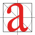
Font metrics refers to metadata consisting of numeric values relating to size and space in the font overall, or in its individual glyphs. Font-wide metrics include cap height, x-height, ascender height, descender depth, and the font bounding box. Glyph-level metrics include the glyph bounding box, the advance width (total space for the glyph), and sidebearings (space that pads the glyph outline on either side).
[edit] Serifs

Although most typefaces are characterised by their use of serifs, there are superfamilies that incorporate serif (antiqua) and sans-serif (grotesque) or even intermediate slab serif (egyptian) or semi-serif fonts with the same base outlines.
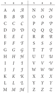
A more common font variant, especially of serif typefaces, is that of alternate capitals either with swashes to go with italic minuscules or of a flourish design for use as initials (drop caps).
[edit] Proportion
Just like serifness most typefaces are, if the script provides the possibility, either proportional or monospaced (typewriter-style), but there are superfamilies covering both.
[edit] Etymology
The term font, a cognate of the word fondue, derives from Middle French fonte, meaning "(something that has been) melt(ed)", referring to type produced by casting molten metal at a type foundry. English-speaking printers have used the term fount for centuries to refer to the multi-part metal type used to assemble and print in a particular size and typeface.[2]
[edit] References
- ^ "Basic Letterpress Tools". http://my.execpc.com/~bosshard/printing/letrprss/basictools.html. Retrieved on 2008-12-7.
- ^ "font. (n.d.). Online Etymology Dictionary". http://dictionary.reference.com/browse/font. Retrieved on 2008-01-14.
- Blackwell, Lewis. 20th Century Type. Yale University Press: 2004. ISBN 0-300-10073-6.
- Fiedl, Frederich, Nicholas Ott and Bernard Stein. Typography: An Encyclopedic Survey of Type Design and Techniques Through History. Black Dog & Leventhal: 1998. ISBN 1-57912-023-7.
- Lupton, Ellen. Thinking with Type: A Critical Guide for Designers, Writers, Editors, & Students, Princeton Architectural Press: 2004. ISBN 1-5689-8448-0.
- Macmillan, Neil. An A–Z of Type Designers. Yale University Press: 2006. ISBN 0-300-11151-7.
|
|||||||||||||||||||||||||||||||


