Scientific visualization
From Wikipedia, the free encyclopedia

Scientific visualization (also spelled scientific visualisation) is an interdisciplinary branch of science, primarily concerned with the visualization of three dimensional phenomena, such as architectural, meteorological, medical, biological systems. The emphasis is on realistic rendering of volumes, surfaces, illumination sources, and so forth, perhaps with a dynamic (time) component.[2]
Scientific visualization focuses on the use of computer graphics to create visual images which aid in understanding of complex, often massive numerical representation of scientific concepts or results.[3]
Contents |
[edit] Overview

The aim and scope of scientific visualization was first laid out in McCormick's 1987 definition: "the use of computer graphics to create visual images which aid in understanding of complex, often massive numerical representation of scientific concepts or results."[3]
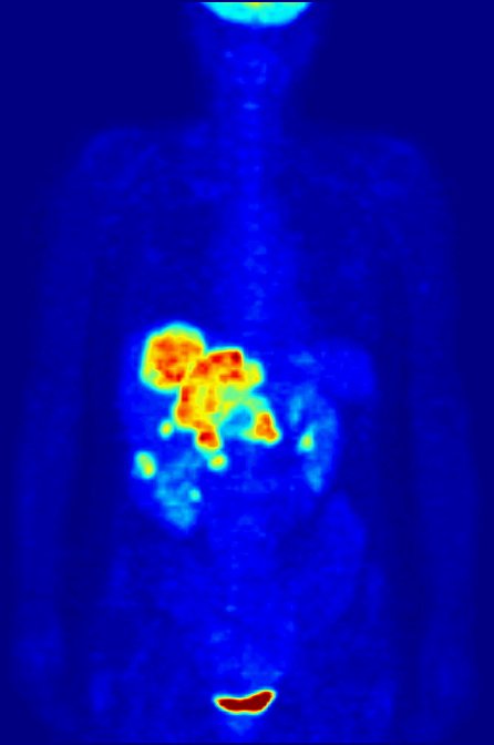
Such numerical representations, or datasets, may be the output of simulations (e.g., fluid flow or molecular dynamics) or empirical data (e.g., recordings from geological, meteorological or astrophysical instruments). In the case of medical data (CT, MRI, etc.) one often hears the term medical visualization.[5]
Scientific visualization is not an end in itself, but a component of many scientific tasks that typically combine interpretation and manipulation of scientific data and models. Scientists visualize data to look for patterns, features, relationships and anomalies--in other words, to aid understanding. Visualization should thus be thought of as task driven rather than data driven.[5][6]
[edit] History
The visualizing of science is as old as science itself. Legend has Archimedes being slain while drawing geometrical figures in the sand. Astronomical charts were produced in the Middle Ages as were arrow plots of prevailing wind over the oceans and magnetic charts that include isolines. The role of visual perception in data understanding has long been understood.[7] The field of scientific visualization, as the discipline employing computational means, is still new. It is "launched" only in 1987 by the National Science Foundation report, "Visualization in Scientific Computing".[8]
[edit] 1980s : The foundation
The roots of scientific visualization dates back to the era of vacuum tube computers. Its origin parallels the development of computer graphics. Early software was homegrown and equipment expensive. While researchers were modeling the actions of scientific phenomena, Hollywood began focusing on algorithms to make things look good. Form and function came together in the mid 1980s, when increased access to high-performance computing created demand for better analysis, discovery and communications tools.[9] Sensors and supercomputer simulations supplied such large amounts of data that new and far more complex visualization algorithms and tools were required.[7]
In October 1986 the National Science Foundation sponsored a meeting of a "Panel on Graphics, Image Processing and Workstations" to make recommendations for acquiring graphical hardware and software at research institutions doing advanced scientific computing. The application of graphics and imaging techniques to computational science was a new area of endeavor which the Panel members termed "Visualization in Scientific Computing" (ViSC). The Panel stated that scientific visualization was emerging as a major computer-based technology requiring significant enhanced federal support.[10]
The first workshop on "Visualization in Scientific Computing" in 1987 brought together researchers from academia, industry and government. The report summed up the panorama of scientific imagery and its needs for the future.[11] The 1987 report McCormick states:
- "Scientists need an alternative to numbers. The use of images is a technical reality nowadays and tomorrow it will be an essential requisite for knowledge. The ability of scientists to visualize calculations and complex simulations is absolutely essential to ensure the integrity of analyses, to promote scrutiny in depth and to communicate the result of such scrutiny to others... The purpose of scientific calculation is looking, not enumerating. It is estimated that 50% of the brain's neurons are associated with vision. Visualization in a scientific calculation is aimed at putting this neurological machinery to work".[12]
This report made clear that visualization has the potential for fostering important scientific breakthroughs. This helped unify the field of computer graphics, image processing, computer vision, computer-aided design, signal processing and the study of human/computer interface. This fostered the research and development from advanced scientific workstation hardware and software and networking, with conferences, journals, tradeshows, to videotapes, books, CD ROMs etc.[9] Since then scientific visualization has experienced vast growth and in the 1990s it emerged as a recognized discipline.[7]
[edit] 1990s : The rise of a discipline
In the beginnings in 1990s different approaches to scientific visualization emerged. Daniel Thalmann (1990) presented scientific visualization as the new approach in the field of numerical simulation, which focuses on basic geometric, animation and rendering, as well as concrete applications in sciences and medicine.[13]
Ed Ferguson in 1991 defined scientific visualization as a methodology: "a multidisciplinary methodology which employs the largely independent, but converging fields, of computer graphics, image processing, computer vision, computer aided design, signal processing and user interface studies. Its specific goal is to act as a catalyst between scientific computation and scientific insight. Scientific visualization came into being to meet the ever increasing need to deal with highly active, very dense data sources".[14]
Brody in 1992 stated that Scientific visualization is concerned with exploring data and information in such a way as to gain understanding and insight into the data. This is a fundamental objective of much scientific investigation. To achieve this goal, scientific visualization utilizes aspects in the areas of computer graphics, user-interface methodology, image processing, system design, and signal processing.[15]
In 1994 Clifford A. Pickover summarized that scientific visualization deals with the application of computer graphics to scientific data for purposes of gaining insight, testing hypotheses, and general elucidation.[10]
[edit] State of the art

The Britannica still presents scientific visualization as a part of computer graphics, in which simulations of scientific events—such as the birth of a star or the development of a tornado—are exhibited pictorially and in motion...[17]
A recent 2007 ACM SIGGRAPH Workshop for Scientific Visualization[18] educates the principles and applications of scientific visualization. Underlying concepts presented are visualization, human perception, scientific methods, and the various aspects of data, such as acquisition, classification, storage and retrieval of data. The visualization techniques they have determined are 2-d, 3-d and multi-dimensional visualization techniques, such as color transformations, glyphs for high dimensional data sets, visualization of gaseous and fluid information, volume rendering, isolines and isosurfaces, coloring, particle tracing, animation, techniques in virtual environments, and interactive steering. And further topics are interaction techniques, existing visualization systems and tools, aesthetics in visualization, and related topics as mathematical techniques, computer graphics and general computer science.[18]
Nowadays definitions sometimes stipulate the difference between "Scientific visualization" and "Information visualization". For example the ETH Zurich states that scientific visualization provides graphical representations of numerical data for their qualitative and quantitative analysis. In contrast to a fully automatic analysis (e.g. with statistical methods), the final analytic step is left to the user, thus utilizing the power of the human visual system. Scientific visualization differs from the related field of information visualization in that it focuses on data that represent samples of continuous functions of space and time, as opposed to data that are inherently discrete.[19]
[edit] Scientific visualization topics


[edit] Computer animation
Computer animation is the art, technique and science of creating moving images via the use of computers. Increasingly it is created by means of 3D computer graphics, though 2D computer graphics are still widely used for stylistic, low bandwidth, and faster real-time rendering needs. Sometimes the target of the animation is the computer itself, but sometimes the target is another medium, such as film. It is also referred to as CGI (Computer-generated imagery or computer-generated imaging), especially when used in films.
[edit] Computer simulation
Computer simulation is a computer program, or network of computers, that attempts to simulate an abstract model of a particular system. Computer simulations have become a useful part of mathematical modelling of many natural systems in physics, and computational physics, chemistry and biology,; human systems in economics, psychology, and social science; and in the process of engineering and new technology, to gain insight into the operation of those systems, or to observe their behavior.[20] The simultaneous visualization and simulation of a system is called visulation.
Computer simulations vary from computer programs that run a few minutes, to network-based groups of computers running for hours, to ongoing simulations that run for days. The scale of events being simulated by computer simulations has far exceeded anything possible (or perhaps even imaginable) using the traditional paper-and-pencil mathematical modeling: over 10 years ago, a desert-battle simulation, of one force invading another, involved the modeling of 66,239 tanks, trucks and other vehicles on simulated terrain around Kuwait, using multiple supercomputers in the DoD High Performance Computer Modernization Program.[21]
[edit] Information visualization
Information visualization is the study of the visual representation of large-scale collections of non-numerical information, such as files and lines of code in software systems[22] library and bibliographic databases, networks of relations on the internet, and so forth.[2]
Information visualization focused on the creation of approaches for conveying abstract information in intuitive ways. Visual representations and interaction techniques take advantage of the human eye’s broad bandwidth pathway into the mind to allow users to see, explore, and understand large amounts of information at once.[23]
[edit] Interface technology and perception
Interface technology and perception shows how new interfaces and a better understanding of underlying perceptual issues create new opportunities for the scientific visualization community.[7]
[edit] Surface rendering
Rendering is the process of generating an image from a model, by means of computer programs. The model is a description of three dimensional objects in a strictly defined language or data structure. It would contain geometry, viewpoint, texture, lighting, and shading information. The image is a digital image or raster graphics image. The term may be by analogy with an "artist's rendering" of a scene. 'Rendering' is also used to describe the process of calculating effects in a video editing file to produce final video output. Important rendering techniques are:
- Scanline rendering and rasterisation
- A high-level representation of an image necessarily contains elements in a different domain from pixels. These elements are referred to as primitives. In a schematic drawing, for instance, line segments and curves might be primitives. In a graphical user interface, windows and buttons might be the primitives. In 3D rendering, triangles and polygons in space might be primitives.
- Ray casting
- Ray casting is primarily used for realtime simulations, such as those used in 3D computer games and cartoon animations, where detail is not important, or where it is more efficient to manually fake the details in order to obtain better performance in the computational stage. This is usually the case when a large number of frames need to be animated. The resulting surfaces have a characteristic 'flat' appearance when no additional tricks are used, as if objects in the scene were all painted with matte finish.
- Radiosity
- Radiosity, also known as Global Illumination, is a method which attempts to simulate the way in which directly illuminated surfaces act as indirect light sources that illuminate other surfaces. This produces more realistic shading and seems to better capture the 'ambience' of an indoor scene. A classic example is the way that shadows 'hug' the corners of rooms.
- Ray tracing
- Ray tracing is an extension of the same technique developed in scanline rendering and ray casting. Like those, it handles complicated objects well, and the objects may be described mathematically. Unlike scanline and casting, ray tracing is almost always a Monte Carlo technique, that is one based on averaging a number of randomly generated samples from a model.
[edit] Volume rendering
Volume rendering is a technique used to display a 2D projection of a 3D discretely sampled data set. A typical 3D data set is a group of 2D slice images acquired by a CT or MRI scanner. Usually these are acquired in a regular pattern (e.g., one slice every millimeter) and usually have a regular number of image pixels in a regular pattern. This is an example of a regular volumetric grid, with each volume element, or voxel represented by a single value that is obtained by sampling the immediate area surrounding the voxel.
[edit] Volume visualization
Volume visualization examines a set of techniques that allows viewing an object without mathematical representing the other surface. Initially used in medical imaging, volume visualization has become an essential technique for many sciences, portraying phenomena become an essential technique such as clouds, water flows, and molecular and biological structure. Many volume visualization algorithms are computationally expensive and demand large data storage. Advances in hardware and software are generalizing volume visualization as well as real time performances.[7]
[edit] Scientific visualization applications
This section will give a series of examples how scientific visualization can be applied today.[24]
[edit] In the natural science
 Star formation[25] |
 Gravity waves[26] |
 Massive Star Supernovae Explosions |
 Molecular rendering |
Star formation: The featured plot is a Volume plot of the logarithm of gas/dust density in an Enzo star and galaxy simulation. Regions of high density are white while less dense regions are more blue and also more transparent.
Gravity waves: Researchers used the Globus Toolkit to harness the power of multiple supercomputers to simulate the gravitational effects of black-hole collisions.
Massive Star Supernovae Explosions: In the image three Dimensional Radiation Hydrodynamics Calculations of Massive Star Supernovae Explosions The DJEHUTY stellar evolution code was used to calculate the explosion of SN 1987A model in three dimensions.
Molecular rendering: VisIt's general plotting capabilities were used to create the molecular rendering shown in the featured visualization. The original data was taken from the Protein Data Bank and turned into a VTK file before rendering in VisIt.
[edit] In geography and ecology
 Terrain rendering |
 Climate visualization[27] |
 Atmospheric Anomaly in Times Square |
Terrain rendering: VisIt can read several file formats common in the field of Geographic Information Systems (GIS), allowing you to plot raster data such as terrain data in your visualizations. The featured image shows a plot of a DEM dataset containing mountainous areas near Dunsmuir, CA. Elevation lines are added to the plot to help delineate changes in elevation.
Tornado Simulation: This image was created from data generated by a tornado simulation calculated on NCSA's IBM p690 computing cluster. High-definition television animations of the storm produced at NCSA were included in an episode of the PBS television series NOVA called "Hunt for the Supertwister." The tornado is shown by spheres that are colored according to pressure; orange and blue tubes represent the rising and falling airflow around the tornado.
Climate visualization: This visualization depicts the carbon dioxide from various sources that are advected individually as tracers in the atmosphere model. Carbon dioxide from the ocean is shown as plumes during February 1900.
Atmospheric Anomaly in Times Square In the image VisIt was used to visualize the results from the SAMRAI simulation framework of an atmospheric anomaly in and around Times Square.
[edit] In the formal sciences
 Computer mapping of topographical surfaces[28] |
 Curve plots |
 Image annotations |
 Scatter plot |
Computer mapping of topographical surfaces: Through computer mapping of topographical surfaces, mathematicians can test theories of how materials will change when stressed. The imaging is part of the work on the NSF-funded Electronic Visualization Laboratory at the University of Illinois at Chicago
Curve plots: VisIt can plot curves from data read from files and it can be used to extract and plot curve data from higher dimensional datasets using lineout operators or queries. The curves in the featured image correspond to elevation data along lines drawn on DEM data and were created using VisIt's lineout capability. Lineout allows you to interactively draw a line, which specifies a path for data extraction. The resulting data was then plotted as curves.
Image annotations: The featured plot shows Leaf Area Index (LAI), a measure of global vegetative matter, from a NetCDF dataset. The primary plot is the large plot at the bottom, which shows the LAI for the whole world. The plots on top are actually annotations that contain images that VisIt generated earlier. Image annotations can be used to include material that enhances a visualization such as auxiliary plots, images of experimental data, project logos, etc.
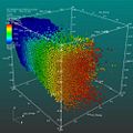
Scatter plot: VisIt's Scatter plot allows you to visualize multivariate data of up to four dimensions. The Scatter plot takes multiple scalar variables and uses them for different axes in phase space. The different variables are combined to form coordinates in the phase space and they are displayed using glyphs and colored using another scalar variable.
[edit] In the applied sciences
 Porsche 911 model |
 YF-17 aircraft Plot |
 City rendering |
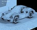
Porsche 911 model: NASTRAN model The featured plot contains a Mesh plot of a Porsche 911 model imported from a NASTRAN bulk data file. VisIt can read a limited subset of NASTRAN bulk data files, generally enough to import model geometry for visualization.
YF-17 aircraft Plot: Plot of YF-17 aircraft The featured image displays plots of a CGNS dataset representing a YF-17 jet aircraft. The dataset consists of an unstructured grid with solution. VisIt created the image using a Pseudocolor plot of the dataset's Mach variable, a Mesh plot of the grid, and Vector plot of a slice through the Velocity field.
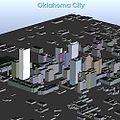
City rendering: Here VisIt read in an ESRI shapefile containing a polygonal description of the building footprints and then resampled the polygons onto a rectilinear grid, which was extruded into the featured cityscape.
Inbound traffic measured: This image is a visualization study of inbound traffic measured in billions of bytes on the NSFNET T1 backbone for the month of September 1991. The traffic volume range is depicted from purple (zero bytes) to white (100 billion bytes). It represents data collected by Merit Network, Inc.[29]
[edit] Scientific visualization experts
- Bruce H. McCormick
- Bruce H. McCormick (1930 - 2007) was an American computer scientist, who studied Physics from MIT, Cambridge University and Harvard University in the 1950s. In the 1960s he initiated and directed the ILLIAC III Image Processing Computer project and developed the first imaging of blood flow and macular degeneracy in the human retina. In the 1980s he organized and chaired the first Brain Mapping Machine Design Workshop in 1985. Two years later in 1987, he developed and promoted the concept of "scientific visualization" at the National Science Foundation Advisory Panel on Graphics, Image Processing, and Workstations.[30]
- Thomas A. DeFanti
- Thomas A. DeFanti (born 1948) is an American computer graphics researcher and Director of the Electronic Visualization Laboratory (EVL), who studied mathematics and Computer Information Science, with a PhD in Computer Graphics Research received in 1973. He joined the faculty of the University of Illinois at Chicago, and the next he amassed a number of credits. He cofounded the Electronic Visualization Laboratory (EVL), used the EVL hardware and software for the computer animation produced for the Star Wars movie.[31] DeFanti contributed greatly to the growth of the SIGGRAPH organization and conference.
- Maxine D. Brown
- Maxine D. Brown is an American computer scientist, and associate director of the Electronic Visualization Laboratory (EVL). She also studied Mathematics and later Computer Science in the 1970s. She has a long history of service to the computer graphics and supercomputing communities, and has contributed to many facets of SIGGRAPH.


- Clifford A. Pickover
- Clifford A. Pickover is an American author, editor, and columnist in the fields of science, mathematics, and science fiction, primary interested in finding new ways to expand creativity by melding art, science, mathematics, and other seemingly disparate areas of human endeavor.[32] In the 1990s he has edited several books, like "Frontiers of Scientific Visualization" (1994) and "Visualizing Biological Information" (1995).
- Lawrence Jay Rosenblum
- Lawrence J. Rosenblum (born 1949) is an American mathematician, and Program Director for Graphics and Visualization at the National Science Foundation. Rosenblum's research interests include mobile augmented reality (AR), scientific and uncertainty visualization, VR displays, and applications of VR/AR systems.[33] His research group has produced advances in mobile augmented reality (AR), scientific and uncertainty visualization, VR displays, applications of VR/AR systems, and understanding human performance in graphics systems.
Other visualisation experts in this field:
- Donna Cox
- Pat Hanrahan
- Bill Hibbard
- Jim Hoffman
- Chris Lilley (W3C)
- Julian Lombardi
- Dietmar Saupe
- Jennifer Strahl
See furtHer: Category:Computer graphics researchers
[edit] Scientific visualization organizations
Important laboratory in the field are:
- Electronic Visualization Laboratory
- NASA Goddard Scientific Visualization Studio.[34]
Conferences in this field are:
- Eurographics
- Graphicon: the largest computer graphics conference in the former Soviet Union
- IEEE Visualization conferences
- SIGGRAPH: world biggest computer graphics conference
See further: Category:Computer graphics organizations
[edit] See also
- ACM Transactions on Graphics
- Baudline
- Data visualization
- Molecular graphics
- NCAR Command Language
- Sirius visualization software
- Visual analytics
- Visulation
[edit] References
- ^ Visualizations that have been created with VisIt. at wci.llnl.gov. Updated: November 8, 2007
- ^ a b Michael Friendly (2008). "Milestones in the history of thematic cartography, statistical graphics, and data visualization".
- ^ a b Bruce H. McCormick, Thomas A. DeFanti and Maxine D. Brown (eds.) (1987). Visualization in Scientific Computing. ACM Press
- ^ NSF (2001). Worth at Least a Thousand Data Points. www.nsf.gov. Last update 6-17-02. Retrieved 10 July 2008.
- ^ a b Michal Koutek (2003). Scientific Visualization in Virtual Reality: Interaction Techniques and Application Development. Delft University of Technology. p.5.
- ^ A. van Dam and others (2000). "Immersive VR for Scientific Visualization: A Progress Report". In: IEEE Computer Graphics and Applications. Nov/Dec 2000, pp.26–52.
- ^ a b c d e Lawrence J. Rosenblum (ed.) (1994). Scientific Visualization: Advances and challenges. Academic Press.
- ^ Dr. Christopher R. Johnson (2005). "Top Scientific Visualization Research Problems".
- ^ a b Thomas A. DeFanti and Maxine D. Brown (1994). "Foreword" in: Frontiers of Scientific Visualization. Clifford A. Pickover (ed.) New York: John Willey Inc.
- ^ a b Clifford A. Pickover (ed.) (1994). Frontiers of Scientific Visualization. New York: John Willey Inc.
- ^ Xavier Berenguer (1991). "The synthetic image as language". in: Temes de Disseny, I991/5, pp. 239-246.
- ^ McCormick, B. H.. DeFanti, T. A., Brown, M. D. (1987). Visualization in Scientific Computing. In: Computer Graphics, 21, 6, 1987.
- ^ Daniel Thalmann (1990). Scientific Visualization and Graphics Simulation. Wiley.
- ^ Ed Ferguson et al. (1991). Computer Graphics Career Handbook. ACM SIGGRAPH.
- ^ K.W. Brodlie (Edited with others) (1992). Scientific Visualization: Techniques and Applications.
- ^ Pacific Northwest National Laboratory, Retrieved 11 July 2008
- ^ Britannica Online Encyclopedia. "Scientific visualization", 29 April 2008. Retrieved 11 July 2008.
- ^ a b Outline UFE Workshop for Scientific Visualization. last modified 2006-09-08. Retrieved 11 July 2008.
- ^ ETH Zurich (2008)Scientific Visualization. Retrieved 11 July 2008.
- ^ Steven Strogatz (2007). "The End of Insight". In: What is your dangerous idea? John Brockman (ed). HarperCollins.
- ^ "Researchers stage largest military simulation ever". (news), Jet Propulsion Laboratory, Caltech, December 1997.
- ^ S.G. Eick (1994). "Graphically displaying text". In: Journal of Computational and Graphical Statistics, vol 3, pp. 127–142.
- ^ James J. Thomas and Kristin A. Cook (Ed.) (2005). Illuminating the Path: The R&D Agenda for Visual Analytics. National Visualization and Analytics Center. p.30
- ^ All examples both images and text here, unless another source is given, are from the Lawrence Livermore National Laboratory (LLNL), from the LLNL website, Retrieved 10-11 July 2008.
- ^ The data used to make this image were provided by Tom Abel Ph.D. and Matthew Turk of the Kavli Institute for Particle Astrophysics and Cosmology.
- ^ BLACK-HOLE COLLISIONS The Globus software creators Ian Foster, Carl Kesselman and Steve Tuecke. Publication Summer 2002.
- ^ Image courtesy of Forrest Hoffman and Jamison Daniel of Oak Ridge National Laboratory
- ^ Image by the Electronic Visualization Laboratory of the University of Illinois at Chicago.
- ^ Image by Donna Cox and Robert Patterson. The National Science Foundation Press Release 08-112.
- ^ Kathy Flores (2007). "Dr. Bruce H. McCormick" Texas A&M University. Retrieved 9 July 2008.
- ^ Thomas A. DeFanti Biography at University of Illinois at Chicago. Retrieved 8 July 2008.
- ^ The Third Culture (2008). "Clifford Pickover". Retrieved 8 July 2008.
- ^ CGI 05 announces two conference panels Wednesday, June 22, 2005. Retrieved 8 July 2008.
- ^ http://svs.gsfc.nasa.gov/ NASA Goddard Scientific Visualization Studio
[edit] Further reading
- Bruce H. McCormick, Thomas A. DeFanti and Maxine D. Brown (eds.) (1987). Visualization in Scientific Computing. ACM Press.
- Gregory M. Nielson, Hans Hagen and Heinrich Müller (1997). Scientific Visualization: Overviews, Methodologies, and Techniques. IEEE Computer Society.
- Clifford A. Pickover (ed.) (1994). Frontiers of Scientific Visualization. New York: John Willey Inc.
- Lawrence J. Rosenblum (ed.) (1994). Scientific Visualization: Advances and challenges. Academic Press.
- Will Schroeder, Ken Martin, Bill Lorensen (2003). The Visualization Toolkit. Kitware, Inc.
- Leland Wilkinson (2005). The Grammar of Graphics, Springer.
[edit] External links
| Wikimedia Commons has media related to: Scientific visualization |
- National Institute of Standards and Technology Scientific Visualizations, with an overview of applications.
- Dataplot is a free, public-domain, multi-platform (Unix, VMS, Linux, Windows 95/98/ME/XP/NT/2000, etc.) software system for scientific visualization, statistical analysis, and non-linear modeling.
- Scientific Visualization Tutorials, Georgia Tech
- NASA Scientific Visualization Studio. They facilitate scientific inquiry and outreach within NASA programs through visualization.
- NovoSpark Visualizer - an advanced visualization tool that enables qualitative analysis of multidimensional data through the exploration of a graphical image.
|
||||||||||||||

