Tube map
From Wikipedia, the free encyclopedia

| Part of a series of articles on The Tube |
|
|---|---|
 |
|
| Overview |
|
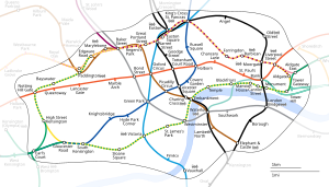
The tube map is the schematic diagram representing the lines, stations, and zones of London's rapid transit rail system, the London Underground (commonly known as the tube, hence the name).
As a schematic diagram it shows not the geographic but the relative positions of stations along the lines, stations' connective relations with each other and their fare zone locations. The basic design concepts have been widely adopted for other network maps around the world, especially that of mapping topologically rather than geographically.
Contents |
[edit] History
[edit] Early maps

What is now a single network of lines controlled by a single organisation began as a collection of independent underground railway companies that construction lines in the 19th and early 20th centuries. These companies published route maps of the own services but did not, generally, co-operate in advertising their services collectively. Early maps were based on standard geographic maps indicating the directions of lines and locations of station, overlaid on geographic features and main roads.
The first combined map was published in 1908 by the Underground Electric Railways Company of London Limited (UERL) in conjunction with four other underground railway companies using the "Underground" brand as part of a common advertising initiative.[1] The map showed eight lines – four operated by the UERL and one from each of the other four companies:
- UERL lines
- Bakerloo Railway - brown
- Hampstead Railway - grey
- Piccadilly Railway - yellow
- District Railway - green
- Other lines
- Central London Railway - blue
- City & South London Railway - black
- Great Northern & City Railway - orange
- Metropolitan Railway - red
The use of a geographic base map presented restrictions in this early map; to enable sufficient clarity of detail in the crowded central area of the map, the extremities of District and Metropolitan lines were omitted so a full network diagram was not provided[2]
The route map continued to be developed and was issued in various formats and artistic styles until 1920, when, for the first time, the geographic background detail was omitted in a map designed by MacDonald Gill.[3] This freed the design to enable greater flexibility in the positioning of lines and stations. The routes became more stylised but the arrangement remained, largely, geographic in nature. The 1932 edition was the last geographic map to be published, before the diagrammatic map was introduced.
[edit] Beck's maps

|
The first diagrammatic map of the Underground was designed by Harry Beck in 1931.[4] Beck was an Underground employee who realised that because the railway ran mostly underground, the physical locations of the stations were irrelevant to the traveller wanting to know how to get to one station from another — only the topology of the railway mattered. This approach is similar to that of electrical circuit diagrams; while these were not the inspiration for Beck's diagram, his colleagues pointed out the similarities and he once produced a joke map with the stations replaced by electrical-circuit symbols and names with terminology, such as "bakelite" for "Bakerloo"[5] In fact, Beck based his diagram on a similar mapping system for underground sewage systems.[citation needed]
To this end, he devised a simplified map, consisting of stations, straight line segments connecting them, and the River Thames; lines ran only vertically, horizontally, or on 45 degree diagonals. To make the map clearer and to emphasise connections, Beck differentiated between ordinary stations (marked with tick marks) and interchanges (marked with diamonds). The Underground was initially sceptical of his proposal — it was an uncommissioned spare-time project, and it was tentatively introduced to the public in a small pamphlet in 1933. It immediately became popular, and the Underground has used topological maps to illustrate the network ever since.
Despite the complexity of making the map, Beck was paid just five guineas for the work.[citation needed] After its initial success, he continued to design the Underground map until 1960, a single (and unpopular) 1939 edition by Hans Scheger being the exception.[6] During this time, as well as accommodating new lines and stations, Beck continually altered the design, for example changing the interchange symbol from a diamond to a circle, as well as altering the line colours - the Central Line from orange to red, and the Bakerloo Line from red to brown. Beck's final design, in 1960, bears a strong resemblance to modern-day maps.[7]
[edit] After Beck
By 1960, Beck had fallen out with the Underground's publicity officer, Harold Hutchinson. Hutchinson, though not a designer himself, drafted his own version of the Tube map in 1960; it removed the smoothed corners of Beck's design, lines were less straight and created some highly cramped areas (most notably, around Liverpool Street station).[8] However, Hutchinson also introduced interchange symbols (circles for Underground-only, squares for interchanges with British Rail) that were black and allowed multiple lines through them, as opposed to Beck who used one circle for each line at an interchange, coloured according to the corresponding line.
In 1964, the design of the map was taken over by Paul Garbutt, who, like Beck, had produced a map in his spare time due to his dislike of the Hutchinson design. Garbutt's map restored curves and bends to the diagram, but retained Hutchinson's black interchange circles (the squares however were replaced with circles with a dot inside). Garbutt continued to produce Underground maps for at least another 20 years — Tube maps stopped bearing the designer's name in 1986, by which time the elements of the map bore a very strong resemblance to today's map.[9] Today, the map bears the legend "This diagram is an evolution of the original design conceived in 1931 by Harry Beck" in the lower right-hand corner.
[edit] Today
Alterations have been made to the map over the years. Recent designs have incorporated changes to the network, such as the Docklands Light Railway and the Jubilee Line Extension. In addition, since 2002 the Underground ticket zones have been added, to better help passengers judge the cost of a journey. Nevertheless the map remains true to Beck's original scheme, and many other transport systems use schematic maps to represent their services, undoubtedly inspired by Beck. A facsimile of Beck's original design is on display on the southbound platform at his local station, Finchley Central. The map is currently maintained and updated by Alan Foale, of The LS Company.
Despite there having been many, many versions over the years, somehow the perception of many users is that the current map actually is, more or less, the 1930 Beck version. This is a remarkable testament to the effectiveness of the original design. Beck did actually draw versions with other formats, 22 1/2 degrees rather than 45 (the Paris Metro version uses 22 1/2 degrees as a base); and an unused version for the 1948 London Olympics.
[edit] Technical aspects
The designers of the map have tackled a variety of problems in showing information as clearly as possible and have sometimes adopted different solutions.
The font for the map, including station names, is Johnston, which has perfect circles for the letter "O".
[edit] Line colours
The table below shows the changing use of colours since the first Beck map. The current colours are taken from the TfL Colour Standards guide,[10] which defines the precise colours and also a colour naming scheme which is particular to TfL. Earlier maps were limited by the number of colours available that could be clearly distinguished in print. Improvements in colour printing technology have reduced this problem and the map has coped with the identification of new lines without great difficulty.
| Line | Current Colour (TfL name) |
History |
|---|---|---|
| Bakerloo | Corporate Brown | |
| Central | Corporate Red | |
| Circle | Corporate Yellow | Originally part of the Metropolitan and District Lines, green (black outline) from 1948, yellow (black outline) 1951-1987 |
| District | Corporate Green | |
| East London | Underground Orange | Originally white (thick red outline), part of the Metropolitan Line (green, then purple) until 1970, white (thick purple outline) until 1990 |
| Hammersmith & City | Underground Pink | Part of the Metropolitan Line until 1990 |
| Jubilee | Corporate Grey | Baker Street to Stanmore section originally part of the Metropolitan Line, then Bakerloo Line from 1939 to 1979. |
| Metropolitan | Corporate Magenta | In the 1930s and 1940s the District and Metropolitan Lines were shown combined, in green |
| Northern | Corporate Black | |
| Piccadilly | Corporate Blue | |
| Victoria | Corporate Light Blue | |
| Waterloo & City | Corporate Turquoise | Part of British Rail until 1994, white (black outline) |
| Tramlink (not shown on the standard map - see below) | Trams Green (beaded line) |
|
| Docklands Light Railway | DLR Turquoise (double stripe) |
White (thick dark blue outline) until 1994 |
| London Overground | Orange (double stripe) |
Various components were previously shown in Network Rail colours, East London Line colours or not at all. |
| Network Rail (selected lines only were shown up to November 2007 - see below) | Black (double stripe) |
Orange from 1985, white (orange outline) 1987-1990 |
| Northern City | Now a Network Rail line | Originally white (thick purple outline), black as part of the Northern Line, white (thick black outline) from 1970 |
Service information is indicated by the format:
- Solid colour – normal service
- Outline colour – limited service
- Alternating solid and outline colour – under construction or closed for renovation
[edit] Station marks
An important symbol that Beck introduced was the 'tick' to indicate stations. This allowed stations to be placed closer together while preserving clarity, because the tick was only on the side of the line nearer the station name (ideally centrally placed, though the arrangement of lines did not always allow this).
From the start, interchange stations were given a special mark to indicate their importance, though its shape changed over the years. In addition, from 1960, marks were used to identify stations that offered convenient interchange with British Railways (now National Rail). The following shapes have been used:
- Empty circle (one for each line or station, where convenient) - standard default mark
- Empty circle (one for each station) - 1938 experimental map
- Empty diamond (one for each line) - early 1930s
- Empty square - interchange with British Railways, 1960-1964
- Circle with dot inside - interchange with British Rail, 1964-1970
Since 1970 the map has used the British Rail 'double arrow' beside the station name to indicate main-line interchanges. Where the mainline station has a different name from the Underground station that it connects with, since 1977 this has been shown in a box. The distance between the tube station and the mainline station is now shown.
In recent years, some maps have marked stations offering step-free access suitable for wheelchair users with a blue circle containing a wheelchair symbol in white.
Tube stations with links to airports (Heathrow Terminals 1, 2, 3, 4, and 5 for London Heathrow Airport, and London City Airport DLR station) are shown with a black aeroplane symbol, and stations with a National Rail link to airports are shown with a red aeroplane symbol.
Since 2000, stations with a nearby interchange to river bus piers on the Thames have been marked with a small boat symbol, to promote TfL's newly-formed London River Services.
While Eurostar services used Waterloo International the Eurostar logo was shown next to London Waterloo station. On 14 November 2007, these services were transferred to St. Pancras International, and Kings Cross St. Pancras tube station now bears the text "for St. Pancras International", although it does not show the Eurostar logo.
Some interchanges are more convenient than others and the map designers have repeatedly rearranged the layout of the map to try to indicate where the interchanges are more awkward, such as by making the interchange circles further apart and linking them with thin black lines. Sometimes the need for simplicity overrides this goal: the Bakerloo/Northern Lines interchange at Charing Cross is not very convenient and passengers are better off changing at Embankment, but the need to simplify the inner London area means that the map seems to indicate that Charing Cross is the easier interchange.
[edit] Lines or services
The map aims to make the complicated network of services easy to understand, but there are occasions when it might be useful to have more information about the services that operate on each line.
The District Line is the classic example; it is shown as one line on the map, but comprises services on the main route between Upminster and Ealing/Richmond/Wimbledon; between Edgware Road and Wimbledon; and the High Street Kensington to Kensington Olympia shuttle service. For most of its history the map has not distinguished these services, which could be misleading to an unfamiliar user. Recent maps have tried to tackle this problem by separating the different routes at Earl's Court.
Limited-service routes have sometimes been identified with hatched lines (see above), with some complications added to the map to show where peak-only services ran through to branches, such as that to Chesham on the Metropolitan Line. The number of routes with a limited service has declined in recent years as patronage recovered from its early 1980s low point. As there are now fewer restrictions to show, the remaining ones are now mainly indicated in the accompanying text rather than by special line markings.
[edit] Official versions of the tube map
The tube map exists to help people navigate the Underground, and it has been questioned whether it should play a wider role in helping people navigate London itself. The question has been raised as to whether main-line railways should be shown on the map, in particular those in Inner London. The Underground has largely resisted adding additional services to the standard tube map, instead producing separate maps with different information:
- Standard tube map showing Underground, DLR, Overground and zone boundaries.
- Central London map. A cropped and enlarged version of the standard map showing only the central area. Some versions show Thameslink and Northern City Line services.
- Travelcard Zones map. London Connections map showing Underground, DLR, Tramlink, Overground, National Rail, and fare zone boundaries.
- High Frequency Services map. The same as the Travelcard Zones map except that lines offering services at greater than 15-minute intervals are de-emphasised so that the more frequent routes can be seen easily.
- London Connections map. Produced by the Association of Train Operating Companies (ATOC), this provides the same information as TfL's Travelcard Zones map but extends a little further beyond Travelcard Zones 7-9. The National Rail lines are emphasised by thicker lines and coloured according to their train operating company (TOC).
- Tube Access Guide. Underground and DLR only. Indicates stations with full or partial step-free access suitable for wheelchair users.
- Tube Toilet Map. Underground and DLR only. Indicates stations with toilet facilities.
- Tube Bicycle map. Underground and DLR only. Shows sections of the network where bicycles are permitted in green.
- Real Time Disruption map. Underground, DLR and Overground only. Interactive web-based map with disrupted lines and stations highlighted, others in light grey.
- Interactive journey map. Underground, DLR and Overground only. Interactive web-based map that can be used to access information about each station (e.g. bus connections and disabled access).
Maps are produced in different sizes, the most common being Quad Royal poster size and Journey Planner pocket size. The maps showing all the National Rail routes provide useful additional information at the expense of considerably increased complexity, as they contain almost 700 stations. This makes them harder to read, even when A3 size.
[edit] Non-Underground lines on the standard tube map
Some non-Underground lines have appeared on the standard tube map:
- On the early maps which used a geographic background, main line railways were shown as part of the background detail.
- Prior to its transfer to the London Underground in 1994, the Waterloo and City line, was operated by British Rail and its mainline predecessors. The line began appearing on most tube maps, from the mid-1930s.
- For a short period in the late 1930s until 1940, the section of the West London Line linking Willesden Junction to the Metropolitan line's Middle Circle route at Uxbridge Road was shown as a service operated by the Great Western Railway and the London, Midland and Scottish Railway. The service was removed when the line closed to passengers in 1940.[6]
- The North London Line was added to the map in 1977.[11] While run by British Rail, and later by Silverlink, it was shown in British Rail/National Rail colours, although its appearance was intermittent, being omitted from some map editions over the years. In November 2007 it was taken over by London Overground and changed to an orange double stripe. The semi-orbital route originally ran from Richmond to Broad Street, then Richmond to North Woolwich; today the line runs from Richmond to Stratford.
- The West London Line, Watford DC Line and Gospel Oak-Barking line (former British Rail/Silverlink lines) were all added to the standard tube map in 2007 when they were taken over by London Overground, and all are shown as an orange double stripe.
- The Northern City Line, appeared on the original 1908 map as the Great Northern and City Railway. It later appeared as the Great Northern and City section of the Metropolitan Railway and then, from the late 1930s as part of the Northern Line. The service was transferred to British Rail in 1976 and continued to appear until recently.
- Thameslink, opened in 1988, the line having been closed for many years. It offers some relief to the Northern Line as it connects King's Cross St Pancras to London Bridge. Only the central sections between Kentish Town and London Bridge/Elephant and Castle were shown. Its appearance on Tube maps has been intermittent, having being omitted from some map editions over the years.
- The Docklands Light Railway, the automatic light-rail system in the London Docklands area.
Currently the only non-Underground lines shown are the Docklands Light Railway and the London Overground.
When Transport for London expands its London Overground service to include the East London Line in 2010, the East London line will be changed from a solid orange line to a double orange stripe.[12] According to 2007 proposals, it is likely that the addition of the South London Line to London Overground will also add the southern loop onto future tube maps in 2010.[13]
[edit] Underground lines on geographically accurate maps
Transport for London publish several bus maps that depict the approximate paths of tube routes relative to major streets and London bus routes.[14] These maps also show locations of certain cultural attractions and geographic landmarks.
[edit] Cultural references

The design has become so widely known that it is now instantly recognisable as representing London. It has been featured on T-shirts, postcards, and other memorabilia. In 2006, the design came second in a televised search for the most well known British design icon.[15] It is widely cited by academics and designers as a 'design classic'.[16][17][18][19] and it is due to these cultural associations that London Underground does not usually permit the design to be used or altered for any other purpose. This has only been officially sanctioned on a few occasions:
- In 1987, Paul Middlewick 'discovered' that Animals could be created in the Tube map by linking the lines, stations and interchanges. These Animals on the Underground now feature on their own web site.[20]
- In Tate Modern hangs The Great Bear by Simon Patterson, a subtle parody of the contemporary map design, first displayed in 1992, in which the station names on the tube map have been replaced by those of famous figures.
- In 2006, The Guardian published a design based on the tube map, purporting to show the relationships between musicians and musical genres in the 20th century.[21]
- On 11 January 2007, Lord Adonis unveiled a depiction of the map featuring the names of successful schools and students at GCSE level as part of the London Student Awards 2007.
- David Booth's The Tate Gallery by Tube 1986 is one of a series of publicity posters for the Underground.[22] His work showed the lines of the map squeezed out of tubes of paint and has since been used on the cover of the map itself.
- In 2003, to coincide with the publication of a book, the London Transport Museum released a "World Metro Map" strongly based on the London diagram and approved by TfL.
- The Royal Shakespeare Company produced a map in 2007 linking Shakespearean characters according to their traits in a diagram which resembles the map for complexity.
Aspects of the London diagram (the line colours and styles, the station ticks or interchange symbols) are often used in advertising. The 'look' of the London Underground map (including 45 degree angles, evenly spaced 'stations', and some geographic distortion) has been emulated by many other subway systems.[23][24] While London Underground have been protective of their copyright they have also allowed their concepts to be shared with other transport operators (Amsterdam's GVB even pays tribute to them on their map[25]).
[edit] Further reading
- Ken Garland, Mr Beck's Underground Map (Capital Transport, 1994): ISBN 1-85414-168-6
- Mark Ovenden, Metro Maps Of The World (Capital Transport, 2005): ISBN 1-85414-288-7
- Maxwell Roberts, Underground Maps After Beck (Capital Transport, 2005): ISBN 1-85414-286-0
- David Leboff and Tim Demuth, No Need to Ask! (Capital Transport, 1999): ISBN 1-85414-215-1
- Andrew Dow, Telling the Passenger where to get off (Capital Transport, 2005): ISBN 1-85414-291-7
- Douglas Rose, The London Underground: A Diagrammatic History (Capital Transport, 2005): ISBN 1-85414-219-4
[edit] References
- ^ Badsey-Ellis, Antony. London's Lost Tube Schemes. Capital Transport. pp. 282–283. ISBN 1-85414-293-3.
- ^ The problem of truncation remained for nearly half a century. Although all of the western branches of the District and Piccadilly lines were included for the first time in 1933 with Beck's first map, the section of the Metropolitan line beyond Rickmansworth did not appear until 1938 and the eastern end of the District line did not appear on the map until the mid-1950s.
- ^ 1920 map from "A History of the London Tube Maps". http://homepage.ntlworld.com/clivebillson/tube/tube.html. Retrieved on 2009-02-07.
- ^ 1933 map from "A History of the London Tube Maps". http://homepage.ntlworld.com/clivebillson/tube/tube.html. Retrieved on 2009-02-07.
- ^ Train, Omnibus and Tram Staff Magazine, March 1933 – Garland, Ken. Mr Beck's Underground Map. Capital Transport. p. 25. ISBN 1-85414-168-6.
- ^ a b 1939 map from "A History of the London Tube Maps". http://homepage.ntlworld.com/clivebillson/tube/tube.html. Retrieved on 2009-02-07.
- ^ 1960 map from "A History of the London Tube Maps". http://homepage.ntlworld.com/clivebillson/tube/tube.html. Retrieved on 2009-02-07.
- ^ 1963 map from "A History of the London Tube Maps". http://homepage.ntlworld.com/clivebillson/tube/tube.html. Retrieved on 2009-02-07.
- ^ 1986 map from "A History of the London Tube Maps". http://homepage.ntlworld.com/clivebillson/tube/tube.html. Retrieved on 2009-02-07.
- ^ "TfL Colour Standards" (PDF). TfL. 2007-03-02. http://www.tfl.gov.uk/tfl/corporate/media/designstandards/assets/downloads/tfl/ColourStandardsIssue02.pdf. Retrieved on 2008-01-22.
- ^ 1977 map from "The London Tube Map Archive". http://www.clarksbury.com/cdl/maps.html. Retrieved on 2009-02-07.
- ^ "Creating London Overground leaflet" (PDF). November 2007. http://www.tfl.gov.uk/assets/downloads/creating-london-overground.pdf. Retrieved on 2007-11-16.
- ^ Transport for London (2006). "The Tube in 2010". http://www.tfl.gov.uk/resources/corporate/media/pressimages/rez-high/h-tube-map-2010.jpg. Retrieved on 2007-11-03. (map illustrating future development phases as proposed by TfL in 2006, subject to change)
- ^ "Central London Bus Map" (PDF). TfL. http://www.tfl.gov.uk/assets/downloads/Central-London-Day-Bus-Map.pdf. Retrieved on 2009-02-07.
- ^ The Tube Map - The Tube Map - Icons of England
- ^ The London Underground Map - Harry Beck's Design Icon
- ^ London Transport / Designing Modern Britain - Design Museum Exhibition : Design Patron (1933-) - Design/Designer Information
- ^ BBC - h2g2 - Life and Times of the London Underground Map
- ^ Harry Beck and the London Underground Map - The background to the designing of a 'Design Icon' - London Underground Map changing through time but remaining true to Beck's original principle - Designers & Designing - Design & Technology On The Web support resource for students and teachers of Design & Technology at KS3, KS4, A-Level and beyond
- ^ animalsontheunderground.com
- ^ Lynskey, Dorian (3 February 2006). "Going Underground". Guardian Unlimited. The Guardian. http://blogs.guardian.co.uk/culturevulture/archives/2006/02/03/going_underground.html. Retrieved on 2008-04-01.
- ^ The Tate Gallery by Tube from "The London Tube Map Archive". http://www.clarksbury.com/cdl/maps.html. Retrieved on 2009-02-08.
- ^ Underground Railway Maps
- ^ Observer review: Metro Maps of the World by Mark Ovenden | By genre | guardian.co.uk Books
- ^ Metro map : GVB
[edit] External links
| Wikimedia Commons has media related to: London Underground maps |
- Tube maps from TfL
- National Rail maps including London Connections
- Geographically Accurate Tube Map
- Trivia, history and facts on the London Underground Tube map contains more history on the tube map plus alternative designs of the map from Dr Who Conventions, and Simon Patterson's The Great Bear
- Interactive animated journey time map
- Mapper's Delight - all kinds of variations and further information on tube maps
- www.mylookout.net/maps/londonTube/ - Satellite Image Tube Map uses Google maps to find tube stations by zone and/or lines
- London quickmap mapmovies - all kinds of variations on tube maps
- Animals on the Underground - A collection of animals discovered in the Tube Map layout
- A history of the London Tube Maps - complete history of the evolution of the map.
- H2G2 article on the tube map
- The London Tube Map Archive has a collection of tube maps, showing the growth of the system and the changes in the style of the map
- Robert Reynolds Subway Page - links and photos of most world subway system maps, many of which use Beck-inspired design principles

